Some R users become leery of graphical user interfaces. Pointing and clicking and dragging may be convenient, but it can be harder to save, check, or rerun an analysis.
But I think even most hardcore command-line junkies would agree that a drag-and-drop interface can be helpful for some exploratory data visualization.
That’s what the new R package esquisse brings to ggplot2. It gives the best of both worlds: drag-and-drop, plus generating basic ggplot code for the graphs you create. And, it’s pretty cool! esquisse was created by two people at a French R consulting firm, DreamRs. The name esquisse is French for sketch.
Let’s take a look at the package.
You can open esquisse ggplot builder from the RStudio Addins menu. The default behaves like a usual add-in. But you can also open it in your browser if you want. Just set the R option esquisse.display.mode to browser:
library(esquisse)
# Set option for browser
options("esquisse.display.mode" = "browser")
See what happens if you run the esquisse ggplot builder add-in.
It should pop open your default browser. But I prefer the usual RStudio dialog pane, so I set the option to dialog.
options("esquisse.display.mode" = "dialog")
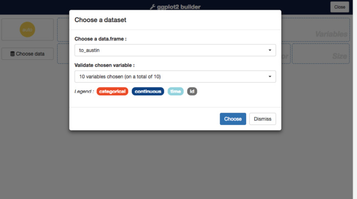
To use the add-in, first choose one of the data frames loaded into your current working session. Then, if you click the Validate Chosen Variable dropdown, you see all the available columns and can choose which ones you want. To keep them all, click Choose.
Sharon Machlis/IDG
esquisse R add-in interface for selecting data
Now you should see a drag-and-drop interface. You should be able to drag one variable into the X box and another into the Y box, as well as choose others for fill or size (depending on the visualization type).
 Sharon Machlis/IDG
Creating an ordered bar graph with the esquisse package
The Data panel at the bottom gives you the option to filter your data. You can change axis titles with the Labels & Title option. Plot options let you change color palette and theme, and also move or remove the legend.
Even if you’re really comfortable creating your graphs by writing ggplot code, this is a great way to see how different color palettes and themes look on your graph.
And now here’s a really cool part of this add-in: If you go to Export & Code, you see the R code that generated your ggplot graph. If you click the Insert code in script link, the code appears wherever your cursor was last in RStudio. Or, perhaps safer, click Copy to Clipboard, close the add-in, and copy the code into your script.
If you want a bar graph where the bars are ordered from low to high, such as the one above, you’re somewhat on your own to either reorder them manually by adding ggplot code, or create ordered factors in your original data. That’s easy to do with forcats:
mydf %>%
mutate(
NewFactor = forcats::as_factor(OriginalColumn),
NewFactor = forcats::fct_reorder(NewFactor, ColumnToOrderBy)
)
Watch the video above to see how this all works! I used airline flight-delay data to demonstrate the esquisse add-in. If you’d like to follow along and download your own data from the U.S. Bureau of Transportation Statistics, head to https://www.transtats.bts.gov/DL_SelectFields.asp?Table_ID=236&DB_Short_Name=On-Time and then tweak the code below as necessary. You need the rio and dplyr packages.
# Where I saved my data file -- change for your own data
mydatafile <- "data/austin_boston_2018_01.csv"
# My home airport code -- save for your own
myairport <- "BOS"
library(dplyr)
mydata <- rio::import(mydatafile) %>%
select(FL_DATE, OP_CARRIER, OP_CARRIER_FL_NUM, ORIGIN, DEST,
DEP_DELAY, ARR_DELAY, AIR_TIME, DISTANCE) %>%
mutate(
DAY_OF_WEEK = weekdays(as.Date(FL_DATE), abbreviate = TRUE),
FL_DATE = as.Date(FL_DATE)
)to_austin <- filter(mydata, ORIGIN == myairport, DEST == "AUS")
from_austin <- filter(mydata, ORIGIN == "AUS", DEST == myairport)
